 ALL OF THIS week I've been considering this well-intentioned poster on the platform wall at Leicester Square station. I have no choice but to look at it because moving to another part of the platform would mean that I'd get on another part of the train, the doors of which don't line up with the platform exit at Charing Cross (which means that instead of stepping straight off the train and upstairs before anyone else, I'd be stuck behind the shuffling hoards of zombies who can't walk any faster than an arthritic chihuahua).
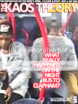
 Everyday I see the poster, I become more incensed. Well, first I was mildly irritated, then annoyed, and eventually full blown vexation set in yesterday. Far be it from me to bring on the Afro centric BS again, but why does the picture show a group of black and mixed-race boys attacking a white guy who looks like something from the cover of Men's Health? It's wrong on so many levels I don't even know where to begin.
Firstly, knife crime perpetrated by young black males is almost exclusively perpetrated against other young black males. But just look at the model they've used. He looks like he stepped off a catwalk, or out of an Abercrombie & Fitch advert. Unless he's a buy-to-let investor (boo, hiss) why would someone who looks and dresses like him be lurking on a rough'n'ready council estate? Oh, I've got it. The advertising agency thought it was an advert for the next Black Balled movie. The white dude's about to get gangbanged. Surely that's the only reasonable interpretation of this f**ked up image?
Don't these people have tone meetings? I'd love to have been a fly-on-the-wall for that one: "Gee whiz Bill, these kindly charity people want us to shoot an advert about abused, damaged kids." "Really Steve? Well gosh, sounds kinda unsexy, uncool. The public don't want all that misery and gloom. It's depressing!" "Well golly Bill, how about we sex it up, stick a hunky model in there and make it look like those young hoodlums want more than his wallet." "Say, Steve, maybe we can get the CocoDorm models to play the thugs?" "Don't be silly, Bill..."
 The text in the advert asks: How Do You Get Inside The Head Of A 16-Year Old Knife Wielding Thug? Well, what exactly will 16-year old black boys going think when they say themselves represented like this? And the general public?
The ads are by the charity Kids Company, although the campaign and the space on which it's displayed were donated. Kids Company say of the campaign,
"We're challenging public attitudes towards anti-social and 'yobbish' behaviour by trying to get people to understand the experiences of children who have been abused and neglected.
You may have seen one of the five ads in the newspaper, at a Tube station, or in a public space. To make the debate and campaign truthful, we used images and facts which reflect the lives of some of the children we see at Kids Company.
The kids featured in the photos volunteered from a local youth club in Camden. We did not involve young people from Kids Company because our client group is too vulnerable.
 The young people themselves were very keen to be part of these ads because they’re fed up of being discussed in the media without having a chance to explain where they’re coming from.
The more people who engage with the campaign, the better. Our aim is to challenge negative perceptions of abused and neglected children and promote greater understanding in relation to the impact of trauma and neglect on the developing brain.
It’s about encouraging everyone to take responsibility for this, so we can address social problems as one."
The adverts are certainly thought provoking, and apart from that one glaring error of judgement, very well done.
Visit Kids Company here. More adverts in the series can be viewed here.


.jpg)
.webp)


.jpg)


.jpg)

























































































































3 comments:
It's such a shame - If you read the captions, you see they were trying to encourage understanding. Instead, it's backfired, and all we see are black boys beating up white boys. Lovely...
Precisely - the text is excellent, let down by appalling imagery created by some PR jerk with *no* understanding. Of anything, probably.
I'm brazilian and a student of english . I was asked to analyse this ad and I thought very interesting the way high society represents the marginalized part of the population. A lot of prejudice and they write an appealing text so that people feel pity of all of them.
Post a Comment